[Next] [Previous ] Chapter19
   [Contents ] [Chapter 18: Multiline Edit Controls ] [Chapter 20:Drag and Drop]

Other Window Classes

Quick-minded reader will have observed that there are more window classes available to the programmer than what are listened on the contents page. The remaining window classes, however, either are rarely used directly by an application or are too trivial to warrant a separate chapter. This chapter serves as a catchall to discuss these unmentionables.
Table 19.1 below lists these window classes and provides a brief description of them.

Table 19.1 Window Classes Covered in this Chapter
Constant
 Description
WC_COMBOBOX
Combo box. This is a combination of an entry field and a list box. It responds to all messages for both controls; additionally, there are a few messages specifically for this class.
WC_FRAME
Frame. This window is used as the primary window for most applications, and is also the basis for dialog windows. While the typical interaction with this class is through  subclassing, the frame window has some useful messages for the developer.
WC_SCROLLBAR Scrollbar. This can be found in many applications, where the environment is larger than the amount of screen allocated for the application. scrollbars allow the user to change the visible portion by scrolling the window.
WC_STATIC
Static window. This is a window whose contents are static, that is, unchangeable by the user. Typically, windows of this class are textual in nature, but they can also be icons, bitmaps, and so on.
WC_TITLEBAR
Titlebar. On a standard window, this window is placed between the system menu and the min/max buttons. It provides a placement for the frame window text and also allows quick access to window resizing, maximizing, and restoring.

Combo Boxes.

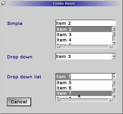
A combo box is displayed as an entry field with either a drown arrow displayed to  its right or a list box displayed below it. Its primary purpose is to display a list of items that can be selected from but added to at the user's discretion. A drop-down combo box is especially useful when screen "real-estate" is limited but a list is still needed; in such cases the down arrow is displayed to the right of an entry field.
Because a combo box is simply a handy way of putting together two existing window classes, the designers decided that it should be able to accept messages for both of its ancestors. Thus, any entry field message (EM_ ) and list box message (LM_ ) can be sent to the control with the expected results. The reader is referred to the chapters dealing with those control classes for more information.
Combo Boxes

Figure 17.1 Entry fields.

Th table below lists the combo-box styles.

Table 19.2 Combo-Box Styles
Style  Description
CBS_SYMPLE
Both the entry field and the list box are displayed. Whenever an item in the  list  box is selected, the text is displayed in the entry field. If the item required is not in the list, the user can type the desired value in the entry field.
CBS_DROPDOWN
This is the same as CBS_SIMPLE except the list box is hidden until the user requests that it be shown; this is accomplished either by clicking with the mouse on the down arrow or pressing the Ctrl-Down arrow keys.
CBS_DROPDOWNLIST
This is the same as CBS_DROPDOWN except the entry field is read-only, meaning items cannot be entered manually by the user.

The following simple application illustrates the different types of combo boxes.

COMBO.C
COMBO.RC
COMBO.H
COMBO.MAK
COMBO.DEF

The combo box, while fairly straightforward in its usage, does have some limitations in its design about which programmers should know. First, there is no easy way to have an ownerdrawn combo box (i.e. ownerdrawn list box within the combo box). This means that, for those with the need to display bitmaps, colors, etc., you're "outta lack". Second, a CBN_SHOWLIST notification indicates when the list is about to be shown, but no corresponding notification indicates when the list is about to be hidden; this one goes in the "honestly, we didn't inhale" group of design idiosyncrasies.

Gotcha!
When a CBN_SHOWLIST notification is received, the list is not shown already, so a CBM_ISLISTSHOWING message will return FALSE. This is documented but often overlooked.
A final note is that combo boxes process the messages and notifications for the entry field and list box by acting as a dispatcher. Thus, code may need slight modifications if it is being copied from another source that was used solely for an entry field/list box and not a combo box. For example, instead of a LN_ENTER notification, there is the CBN_ENTER notification.

Frames

A frame window is, as mentioned in Chapter 9, one of the components of the standard window. It's primary purpose is to keep things organized - it receives messages from the various components (e.g. menu, sizing border, etc.) and dispatches them to the appropriate windows with a "need to know", it is the parent of all of the standard window components, which keeps them contained within its boundaries; it provides a standard look to a standard  window (thus the name), giving the feeling of consistency to the system. Because the frame is the parent of all the components, oftentimes its parent is the desktop itself; when this is the case, it is referred to as the top-level window for the application.
Direct interfacing with the frame does not yield many useful functions - the real "meat" of the frame is accessed through subclassing. (See Chapter 27 for more information on subclassing.)

A note on the WM_UPDATEFRAME message: After looking at the description of the message, readers will undoubtedly question the reasoning for such a message, if the client is the one to add or delete the controls. The answer can be said in one word (with a bit of explanation afterward): "housekeeping". Just because a control or two has been added or deleted by the programmer doesn't mean the frame is going to know about  it. The programmer must indicate the changes to the frame so that it can resize the controls properly when it is resized.

Scrollbars

Scrollbars are used to allow the user to specify a value, within a specified range. Originally, they were intended as navigational tools withing windows (thus, their name), when the viewable area was larger than the visible area. Since then, however, many other purposes have been designed and other, more specialized controls have been created as a result. (see "Combo Boxes" earlier in this chapter, Chapter 24 and Chapter 25.)

A scrollbar consists of three parts - the buttons, the slidetrack and the thumb. The buttons are found on the ends of the scrollbar, and they are used to adjust the position up or down by a "unit". The thumb is a rectangular area in the middle of the scrollbar and is used to adjust the position by an arbitrary amount; usually it also indicates the amount of data visible compared with the total amount of data available. The thumb is sometimes referred to as the slider, but we will refrain from doing so in order to avoid confusion with the control of the same name. The slidetrack is everything else, and the thumb is contained by the slidertrack; the slidertrack is used to adjust the position up/left or down/right one "page" by clicking above/left or below/right of the thumb.
A few properties are associated with a scrollbar. The first is  the range; it is an inclusive set of numbers greater than or equal to zero in which the value of the scrollbar can fall. The fact that neither boundary can be less than zero is significant, since application code may have to be adjusted to account for this. When the scrollbar is created, it has the default range 0 to 100. The second property is the thumbsize; it indicates to the user the amount of data that is visible relative to the  total amount of data available for viewing.
Table 19.3 lists the scrollbars styles.

Table 19.3 Scrollbar Styles
Style  Description
SBS_HORZ
Creates a horizontal scrollbar
SBS_VERT
Creates a vertical scrollbar
SBS_THUMBSIZE
Specifies that the SBCDATA structure in the call to WinCreateWindow contains valid values for the cVisible and cTotal fields.
Used to calculate the size of the scroll-bar slider from the SBCDATA passed to WinCreateWindow.
SBS_AUTOTRACK
Causes the entire slider to track the movement of the mouse pointer when the user scrolls the window. Without this style, only an outlined image of the slider tracks the movement of the mouse pointer, and the slider jumps to the new location when the user releases the mouse button.
SBS_AUTOSIZE
The scrollbar thumb changes the size to reflect the amount of data in the window.

Because the scrollbar is such a simple control, programming it is simple. What is difficult is how the scrollbar is used in an application; it is easy to specify what the valid range of values is and even query the current value, but it isn't as easy to scroll a window appropriately or change the green component in a color window; these things will not be covered in this chapter because the possibilities are endless.

Statics

Static controls have the dubious role of providing information to the user that cannot be modified by him or her. This information can take many forms, the more common of which is text and icons/bitmaps. However, many people fail to realize that there are many forms of the static control and that this flexibility compensates for its lack of functionality.
Speaking of "lack of functionality," let's describe it in a single sentence. For textual static controls, WinSetWindowText and WinQueryWindowText set and query the current text being displayed; for bitmapped (including icons) static controls, two messages are used to specify the bitmap or icon handle and query the current handle.
Table 19.4 lists the static control styles.
 
Table 19.4 Static Control Styles
Style  Description
SS_AUTOSIZE
Specifies that the control is to size itself so that its contents fit.
SS_BITMAP
Specifies that the control is to contain a bitmap, and the text of the control specifies the resource id of the bitmap. If the first byte of the text is hexadecimal x'FF', then the second and the third bytes are used as low and high word of the resource id of the bitmap to load, respectively. If the first byte of the text is '#', then the remainder of the text is considered to be an ASCII representation of the resource ID of the bitmap to load. If the text is empty or does not follow the above format, no bitmap is loaded.
SS_BKGNDFRAME
Creates a box whose color is that of the background. This is similar to, but not the same as, SS_GROUPBOX
SS_BKGNDRECT
Creates a solid rectangle whose color is that of the background.
SS_FGNDFRAME Creates a box whose color is that of the foreground. This is similar to, but not the same as, SS_GROUPBOX
SS_FGNGRECT
Creates a solid rectangle whose color is that of the foreground. This is often used for background shadowing and very thick underlining.
SS_GROUPBOX
Creates a box as in SS_FGNDFRAME, except that the text of the static control is displayed in the top left of the box. This is used to group like controls together with an associated heading.
SS_HALFTONEFRAME
Creates a box that has a halftone outline. This is similar to, but not the same as, SS_GROUPBOX.
SS_HALFTONERECT
Creates a box filled with halftone shading. This is similar to, but not the same as, SS_GROUPBOX.
SS_ICON
The same as SS_BITMAP, except that the resource loaded is expected to be an icon or pointer instead of a bitmap.
SS_SYSICON
The same as SS_BITMAP, except that the resource ID that is specified in the text is interpreted as SPRT_ constant and is used to obtain a system icon as in the WinQuerySysPointer function.
SS_TEXT
Specifies that the static control is to display the text in the manner specified. See the following text for more information.
 
 
Gotcha!
For dialogs containing static controls with the style SS_BITMAP or SS_ICON, the bitmap, icon or pointer must reside in the resource area of the executable. This is true even if the dialog template is defined in the resource area of a DLL. If this behavior is unacceptable, the programmer must use an empty string for the text, load the bitmap, icon, or pointer in the dialog procedure, and specify this as the (already loaded) resource to use by sending the control an SM_SETHANDLE message.

For static controls with the style SS_TEXT, a number of additional styles can be applied that control alignment and world-wrapping. Horizontally, DT_LEFT, DT_CENTER and DT_RIGHT specify  left, center and right-aligned text. Vertically, DT_TOP, DT_VCENTER, and DT_BOTTOM specify top, center and bottom-aligned text. Additionally, DT_WORDBREAK can be specified if and only if DT_LEFT and DT_TOP are specified; this indicates that words are to be wrapped to next line if they do not fit completely within the control's area at the current vertical position. If none of these flags is specified, the default is DT_LEFT and DT_TOP.
Static controls have one other use: Since they do nothing other than display themselves, they are very handy for adding the programmer's behavior withing a dialog via subclassing (See Chapter 27 for more information on subclassing windows.)

Titlebars

The titlebar is a control whose role in the standard window is perfunctory, yet it is still quite important. It automatically provides for mouse-oriented changing of the window's position and maximizing and restoring of the window's size. Also, its interaction with the frame insures that, whenever the frame's window text is changed, it is updated to reflect the new text.
Even with this, there isn't much the programmer can do with the titlebar control directly. Its functions are strictly defined and were not built with other uses in mind. There are no titlebar-specific styles, and it accepts only two messages. These are described in Appendix A.

Next] [Previous ] Chapter19
   [Contents ] [Chapter 18: Multiline Edit Controls ] [Chapter 20:Drag and Drop]