[Next] [Previous ] Chapter16
[Contents ] [Chapter 15: List Boxes ] [Chapter 17: Entry Fields ]

Buttons

The easiest controls to use are buttons. Buttons belong to the class WC_BUTTON. There are five types of buttons - push buttons, radio buttons, three-state buttons, check boxes and owner-drawn.
Push buttons
Figure 16.1 Push buttons.

A push button (see Figure 16.1) sends a WM_COMMAND to its owner immediately when it is pressed. This feature distinguishes the push button from the other button types. Push buttons commonly are used to initiate such actions as "OK", "Cancel" and "Help".

Radio buttons are designed to be used when only one item in a group can be selected. For instance, indicating "AM" or "PM" as a period of time is an example of where radio buttons should be used. There are two styles of radio buttons: BS_AUTORADIOBUTTON and BS_RADIOBUTTON. When using the BS_RADIOBUTTON, the application must highlight the selected button and unhighlight the button previously selected. The system handles this automatically when the BS_AUTORADIOBUTTON  is used. When radio buttons are used, the application can send a BM_QUERYCHECKINDEX message to determine which button was selected when the user exited the dialog box.

In cases where more than one choice can be selected, check boxes should be used. Two styles define check boxes: BS_CHECKBOX or BS_AUTOCHECKBOX. The difference between the two styles is similar in manner to their radio button counterparts, BS_RADIOBUTTON and BS_AUTORADIOBUTTON.

Button Styles

The styles presented in Table 16.1 can be used when creating buttons.


Table 16.1 Button Styles
Style  DescrIption
BS_3STATE Creates a three-state check box that can be selected, unselected, or disabled.
BS_AUTO3STATE
Creates a three-state check box whose state is set by the system automatically.
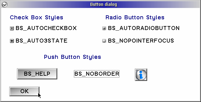
BS_AUTOCHECKBOX
Creates a check box that the system will toggle automatically between selected and unselected.
BS_AUTORADIOBUTTON
Creates a radio button that will disable other radio buttons in the group automatically whenit is selected.
BS_AUTOSIZE
Will size the push button to fit the text label, if -1 is specified as width and height.
BS_BITMAP
Creates a push button, labeled with a bitmap instead of text
BS_CHECKBOX
Creates a check box; it is the application's responsibility to select or deselect the check box.
BS_DEFAULT
Creates a button with thick border boxes; used with BS_PUSHBUTTON or BS_USERBUTTON.
BS_ICON
Creates a push button, labeled with an icon instead of text.
BS_HELP
Creates a push button that sends a WM_HELP message to the owner window; this can be used only with push buttons.
BS_MINIICON
Creates a icon push button with a 16x16 icon.
BS_NOCURSORSELECT
Creates an auto-radio button that is not selected automatically when the button is moved to with the cursor keys.
BS_NOBORDER
Creates a push button with no border; can be used only with push buttons.
BS_NOPOINTERFOCUS
Creates a radio button or check box that does not recive the keyboard focus when the user selects it.
BS_PUSHBUTTON
Creates a push button.
BS_RADIOBUTTON
Creates a radio button.
BS_SYSCOMMAND
Creates a button that posts a WM_SYSCOMMAND when selected; can be used only with push buttons.
BS_USERBUTTON
Creates a user-defined button; generates a BN_PAINT notification message, sent to its owner, when painting is needed.

Example Programm

The following program will create a simple dialog box that contains various types of buttons, Buttons are created both in the resource file and by using WinCreateWindow.

BUTTON.C
BUTTON.RC
BUTTON.H
BUTTON.MAK
BUTTON.DEF

The BUTTON.RC Resource file.

The follwing is the code used to define the dialog box. The background color is set to white using the PRESPARAMS keyword in the BUTTON.RC file.
   DIALOG "Button dialog", IDD_BUTTON, 28, 23, 258, 110,
           FS_NOBYTEALIGN | WS_VISIBLE,
           FCF_SYSMENU | FCF_TITLEBAR
           PRESPARAMS PP_BACKGROUNDCOLORINDEX, CLR_WHITE
The creation of the buttons is specified by the keywords PUSHBUTTON, AUTOCHECKBOX, and AUTORADIOBUTTON in the BUTTON.RC resource file.

DlgProc

            BTNCDATA         bcdData;

            bcdData.cb = sizeof(BTNCDATA);
            bcdData.fsCheckState = 0;
            bcdData.fsHiliteState = 0;
            bcdData.hImage = WinQuerySysPointer(HWND_DESKTOP,
                                             SPTR_ICONINFORMATION,
                                                FALSE);

The WM_INITDLG message processing is used to create the BS_ICON push button. The information icon is loaded from the system using WinQuerySysPointer. This returns a resouce handle(HPOINTER) that is needed in the BTNCDATA structure. The BTNCDATA  structure is defined as follows in \TOOLKIT\H\pmwin.h.
      typedef struct _BTNCDATA    /* btncd */
      {
         USHORT  cb;
         USHORT  fsCheckState;
         USHORT  fsHiliteState;
         LHANDLE hImage;
      } BTNCDATA;

Gotcha!
Programmers must not forget to initialize everything in the BTNCDATA structure. If they don't they will receive an error. cb is always the size of the BTNCDATA structure. fsCheckState indicates whether the initial state of a button is checked or unchecked. fsHiliteState is used to set the highlight or unhighlight state of the button. The last field, hImage, is a handle for a pointer or a bitmap.


Dialog Units - Can We Talk ?

            ptl.x = 175;
            ptl.y = 25;
 /* map out to correct window coordinates           */
            WinMapDlgPoints(hwndWnd,
                            &ptl,
                            1,
                            TRUE);
In this example, we mix the create buttons in the resource file and also dynamically in the C code. There is a difference between the coordinates specified in the resource file and thouse specified in the C file. The resource file uses a coordinate system known as dialog units. These units are based on the size of the system font and are different from pixel units that a window coordinate system uses. In order to place the new push button in the right position, we must first map the dialog units to a window coordinate system.  The dialog coordinates are placed into a POINTL structure, which consists solely of as x and y elements. The function WinMapDlgPoints is explained in Chapter 12.

            WinCreateWindow(hwndWnd,
                            WC_BUTTON,
                            "",
                            WS_VISIBLE|WS_TABSTOP|BS_ICON,
                            ptl.x,
                            ptl.y,
                            WinQuerySysValue(HWND_DESKTOP,
                                             SV_CXICON),
                            WinQuerySysValue(HWND_DESKTOP,
                                             SV_CYICON),
                            hwndWnd,
                            HWND_TOP,
                            IDR_ICON,
                            (PVOID)&bcdData,
                            NULL);

WinCreateWindow is used to create the icon push button. The client area of the dialog is used as both the parent and the owner. The text area is specified as "". The styles specified for the button are WS_VISIBLE|WS_TABSTOP|BS_ICON. WS_TABSTOP indicates that the user can press the TAB key to move to the button. On some button styles this is the default and does not have to be specified. This style is associated with push buttons and check boxes automatically. Icon buttons and radio buttons do not.
The placement of push button is specified at ptl.x and ptl.y, and the width and height are set at the system values for the icon width (SV_CXICON) and icon height (SV_CYICON), respectively. The dialog window hwndWnd will be the owner. The next parameter is the address of the button control data, which is &ButtonData in this example.
            WinSendDlgItemMsg(hwndWnd,
                              IDC_AUTOCHECKBOX,
                              BM_SETCHECK,
                              MPFROMSHORT(TRUE),
                              NULL);

            WinSendDlgItemMsg(hwndWnd,
                              IDR_AUTORADIOBUTTON,
                              BM_SETCHECK,
                              MPFROMSHORT(TRUE),
                              NULL);

            WinSendDlgItemMsg(hwndWnd,
                              IDC_AUTO3STATE,
                              BM_SETCHECK,
                              MPFROMSHORT(2),
                              NULL);
The last step in the dialog initialization procedure sends a BM_SETCHECK to AUTOCHECKBOX, AUTORADIOBUTTON and AUTO3STATE buttons. Also the three-state check-box is sterted in the indeterminate (or grey-scaled) stape by specifying 2 as mpParm2.

Button Actions

The icon button style operates just like a push button. An icon button is identical to a push button in appearance exept for the image on top, and sends a WM_COMMAND message to its owner when it is pressed. Check boxes and radio buttons will send a WM_CONTROL message to their owners only when selected.

Summary

Buttons are the easiest control to program. The three varieties of buttons are push buttons, radio buttons, and check boxes. A push button should be used to indicate an action choice, such as "Save", or a routing choices, such as "Include" or "Delete". A radio button should be used to display mutially exclusive choices, and should always be paired with at least one other radio button in a field. A radio button should not be used when a valid user choice is no selection; instead, a check box should be used. A check box should be used to display a binary choice - that is, a choice with two distinct states. Programmers should make sire that both the checked and unchecked states are clerly understandable from the check box text
[Next] [Previous ]     Chapter16
   [Contents ]  [Chapter 15:  List Boxes ] [Chapter 17: Entry Fields]